Nothing about the brand changes. The navy, the gold, the Cambon headlines and Outfit text, the three collection colours and the star all stay. What changes is how much room they are given.
Photography gets larger. Headlines get bigger and quieter. Sections alternate between navy and cream so the page breathes. Navigation is visible on desktop instead of hidden behind a menu button. The first thing a visitor can do on the home page is search for a place, which today takes three clicks.
Underneath, the redesigned pages drop the old WordPress‑era stylesheet and scripts, load images lazily at the right size, work by keyboard, and respect "reduce motion" settings.
Prepared by Jolora
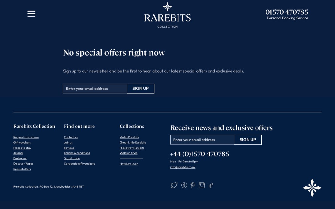
Scope A new header, footer and navigation for every page, and a working redesign of the home page, places to stay, property pages, offers and the journal
Status Built and running on real content, ready to review
Visible navigation
All main sections in the header on desktop, a full‑screen menu on phones, the phone number and brochure request always one tap away.
Search from the hero
Collection, destination and type of break, straight into a filtered list.
Filters that work on phones
A sticky filter bar on desktop, a bottom sheet on phones, active filters shown as removable chips.
Property pages that sell
Photo mosaic with a full‑screen gallery, a sticky enquiry card, facilities, map, and "more like this".
Real content everywhere
Featured places, destinations, guest reviews and journal stories pulled from the CMS rather than typed into the template.
Same CMS, same data
Built inside the existing Laravel and Statamic site. No migration, no new platform, nothing to relearn.
Before and after
Six pages, side by side
Left is the live site today. Right is the redesign running on the same content. Each frame scrolls on its own; switch to the phone view to see the same page at 390 pixels wide.
Home page
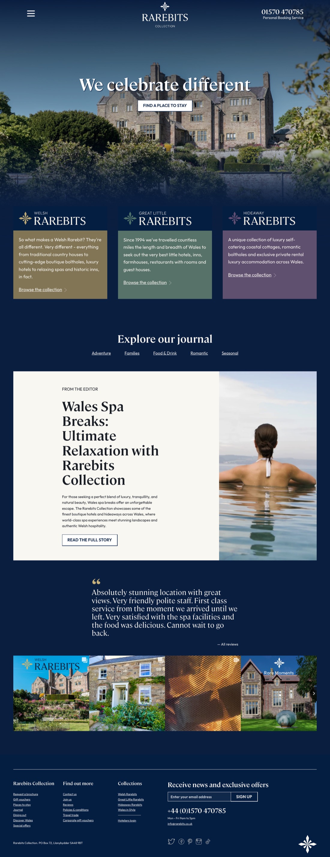
The first screen does the selling: full-bleed photography, the tagline, and a search bar that goes straight to a filtered list.
BeforeLive site
AfterRedesign
BeforeLive site
AfterRedesign
Scroll inside each frame to see the whole page.
Search from the heroCollection, destination and type of break in one line; today a visitor has to find the listing first.
Real contentRecently updated places, the four regions, guest reviews and the three latest journal stories all come from the CMS.
Clear calls to actionPhone, brochure and gift vouchers appear where a visitor is ready to act, not only in the footer.
Places to stay
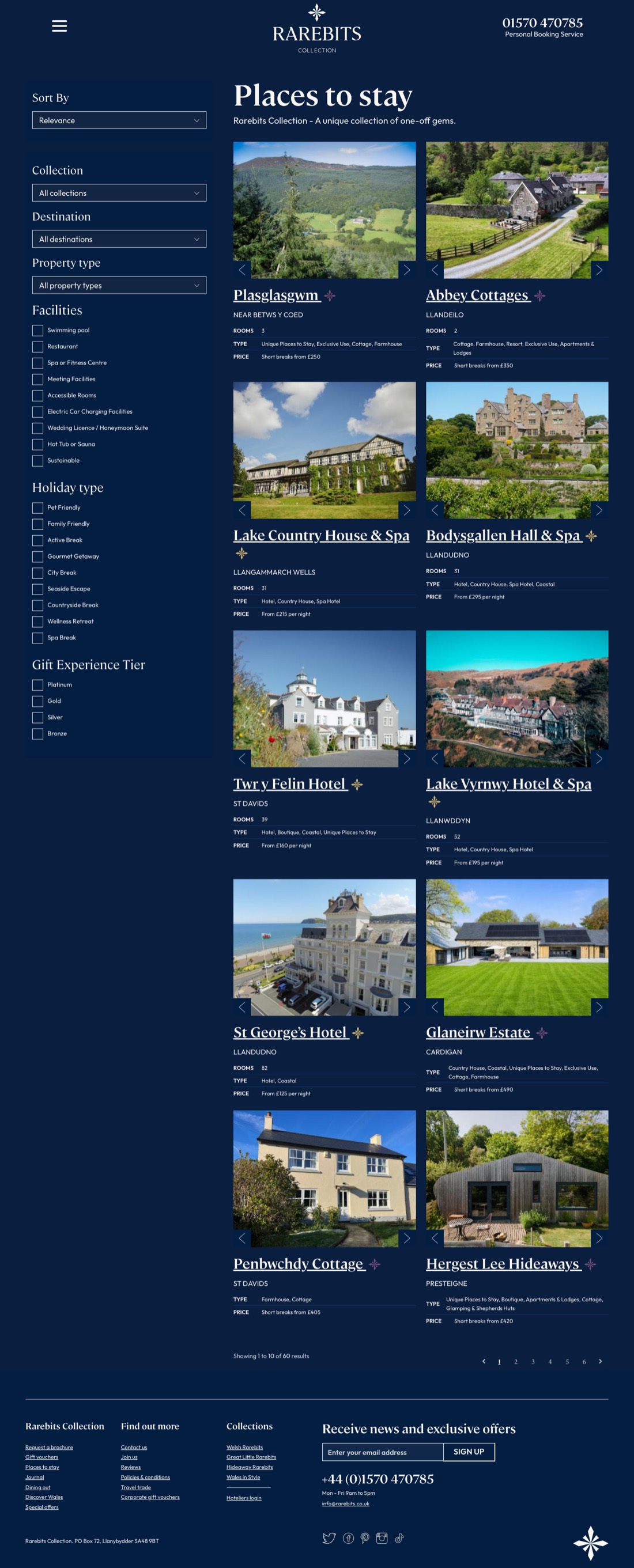
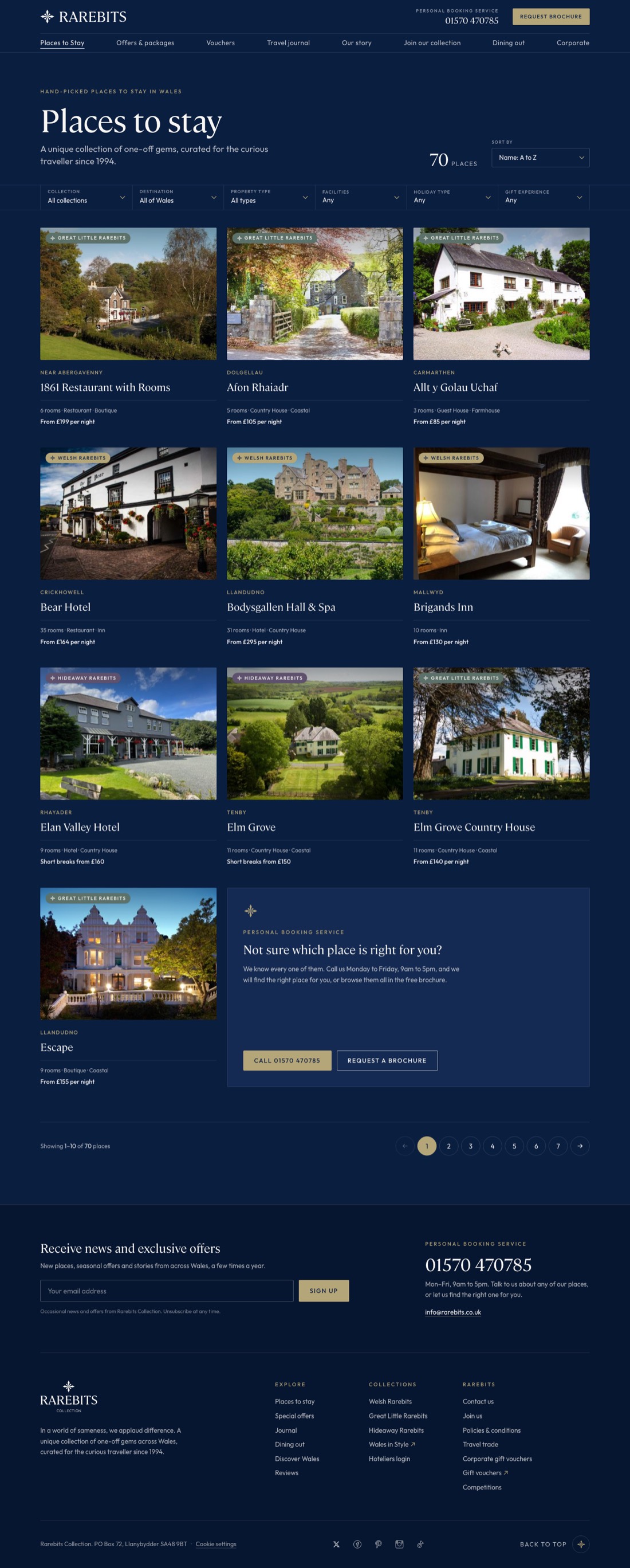
A sticky filter bar on desktop and a bottom sheet on phones, with active filters shown as chips, a live count and crawlable pagination.
BeforeLive site
AfterRedesign
BeforeLive site
AfterRedesign
Scroll inside each frame to see the whole page.
Filters on every deviceThe live site hides all filters on phones. The redesign puts them one tap away.
Three-up cardsCollection badge, area, rooms, type and price on every card, with the whole card as the link.
Helpful empty statesWhen nothing matches, the page says so and offers to clear the filters; out-of-range pages lead back to page one.
Property page
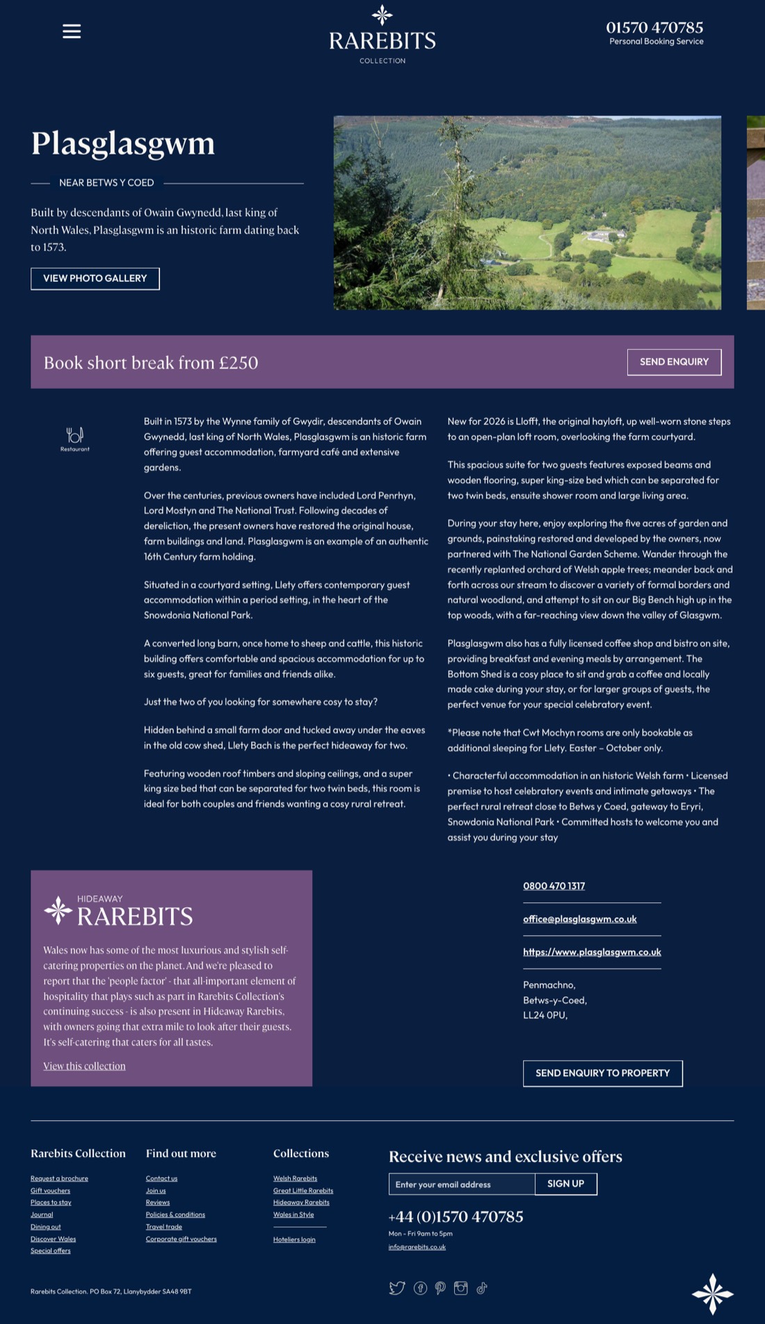
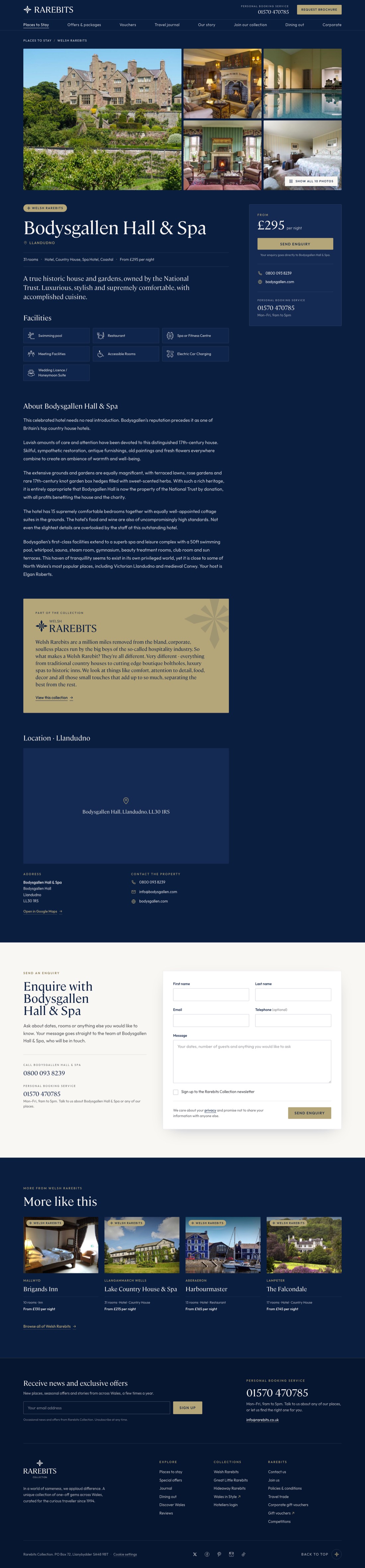
A photo mosaic with a full-screen gallery, the essentials at the top, and an enquiry card that stays in view while you read.
BeforeLive site
AfterRedesign
BeforeLive site
AfterRedesign
Scroll inside each frame to see the whole page.
Gallery firstOne large and four small photos, with swipe on phones and keyboard navigation in the full-screen view.
Sticky enquiry cardPrice line, Send enquiry, phone and website follow the reader down the page.
Map and more like thisA lazily loaded map, the facilities with labels, the collection panel and four similar places.
Offers
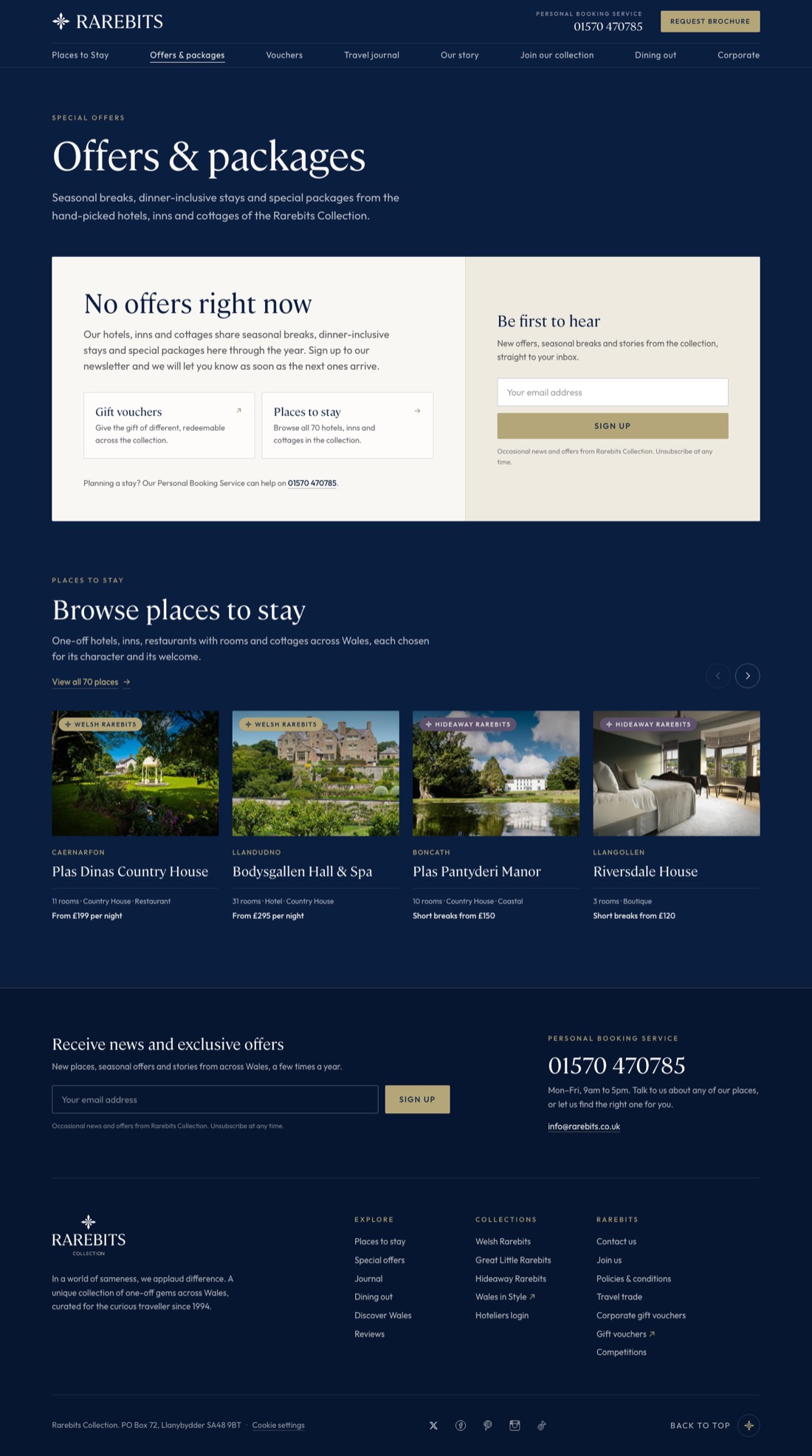
Offer cards grouped by category when there are offers, and an honest, useful empty state when there are not.
BeforeLive site
AfterRedesign
BeforeLive site
AfterRedesign
Scroll inside each frame to see the whole page.
Designed for the real stateThe live Offers page is empty today. The redesign turns that into a newsletter sign-up and a row of places to stay.
Category chipsOnly categories with current offers are shown, each with a count.
Offer pagesImage, validity dates, the participating places with Enquire links, and more offers alongside.
Journal
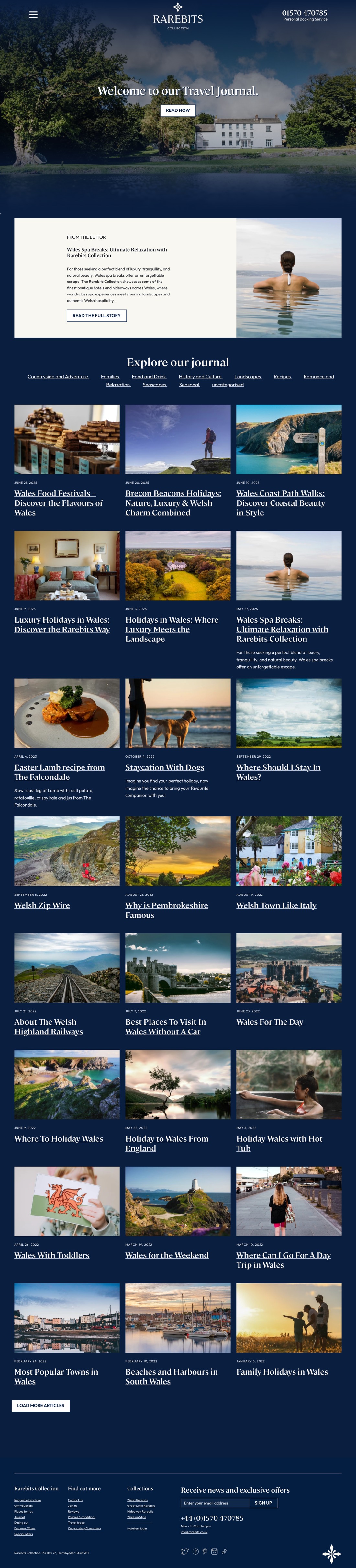
A magazine front: the latest story as a wide feature, category chips, then a three-column grid that loads as you scroll.
BeforeLive site
AfterRedesign
BeforeLive site
AfterRedesign
Scroll inside each frame to see the whole page.
HierarchyOne featured story, then a grid, instead of a long single column.
Categories that workChips link to real category pages; the stray 'uncategorised' label is gone.
Feature storyThe newest article leads as a wide card with its image before the grid begins.
Journal article
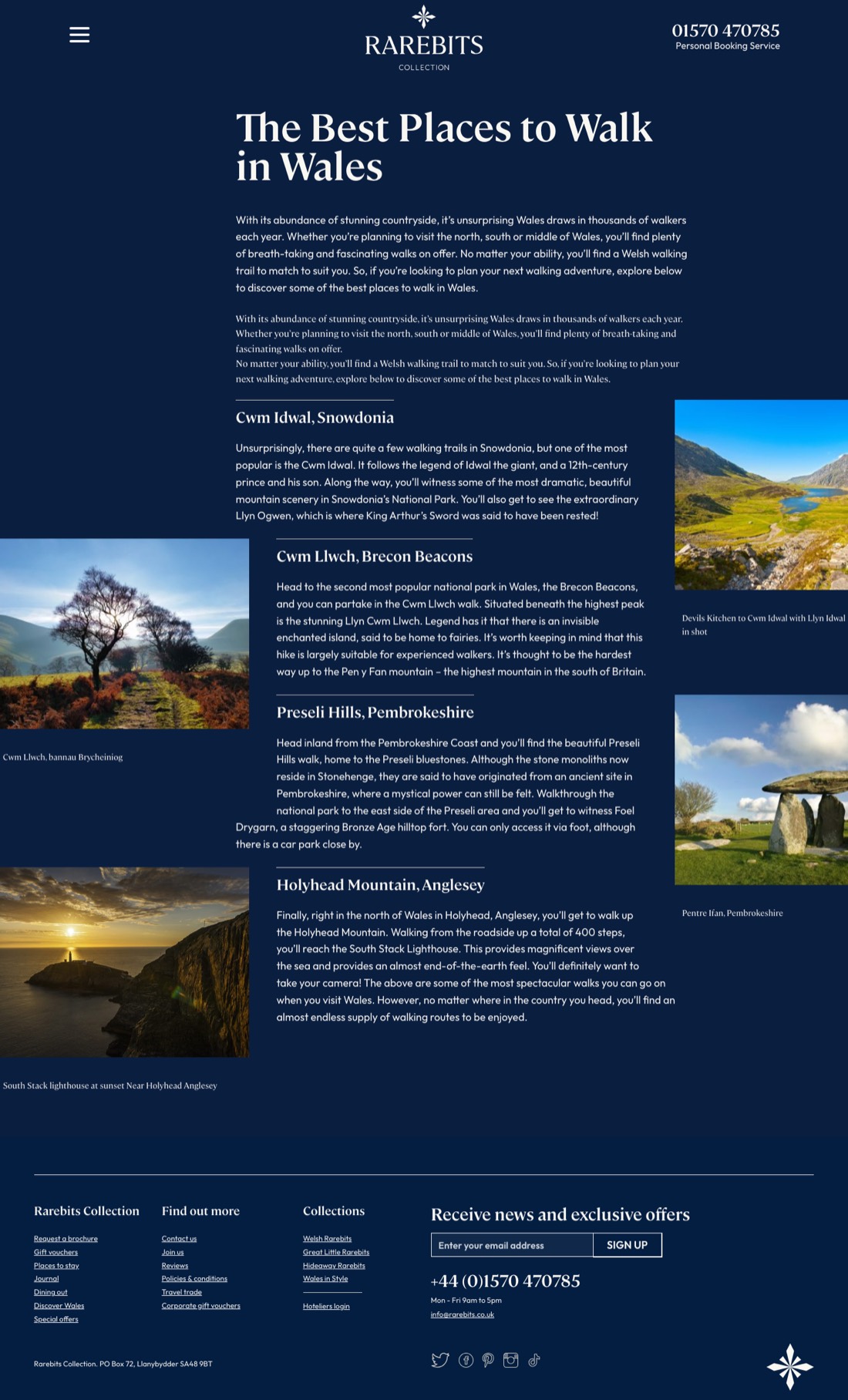
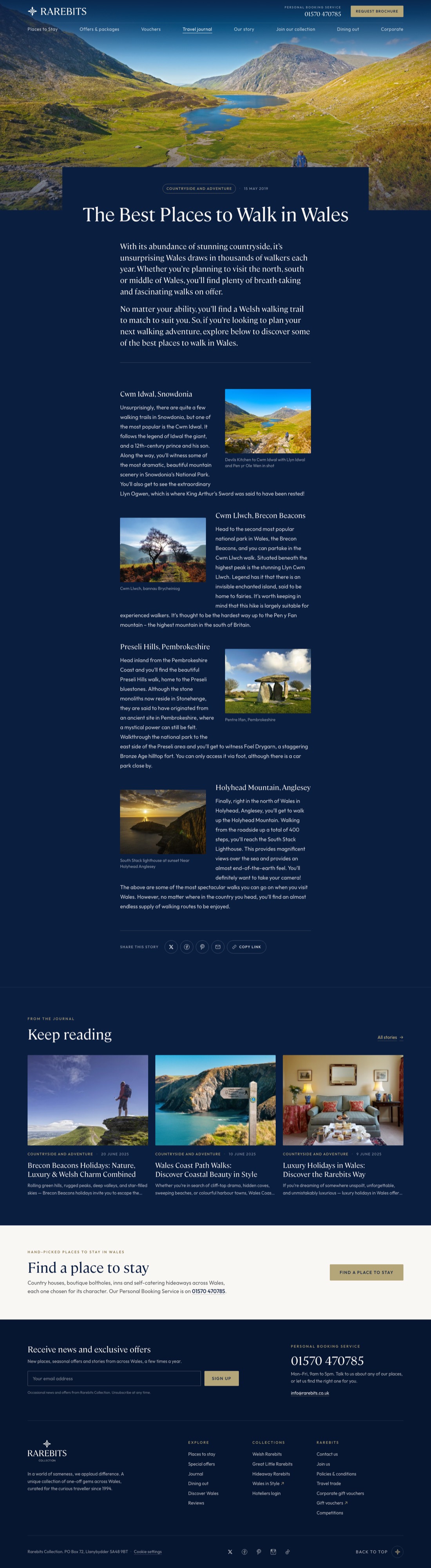
A full-width hero, a comfortable reading width, share links, three more stories and a nudge towards finding a place to stay.
BeforeLive site
AfterRedesign
BeforeLive site
AfterRedesign
Scroll inside each frame to see the whole page.
Reading widthBody text sits at a comfortable measure with large images breaking the column.
Images with roomFull-width photographs break the column; floated images and captions behave on phones.
Keep readingThree related stories by category, then a 'Find a place to stay' band.